Balanced Abstraction – Linear and Textural Dynamics
-
I started playfully calling these pieces ‘bi-chromatic’ as a contrast to my ‘mono-chromatic’ studies. I do seem to like contrasts.
It’s probably easier to think about them — especially the top group on this page — as a variation on ‘Color Fields’ vertically marked by thin lines. These are a riff on my horizontal demarcation pieces. Those are generally homogenous fields above an below a horizontal divide. Here the line is generally a homogenous hue and value cast against a broader background that’s more variegated in texture, hue, and/or value.
I liked the unplanned spontaneity of the backgrounds as contrasted to the carefully wrought rendering of the lines.
The two examples (Whites and Blacks) offered down the page start with a more uniform background.
Those two arose earlier in my explorations where I more interested in differences in pure value with only a bit of concern about the pattern etched into the background.
The newer set is much more emergently rendered, if that provides a conceptual description — you know, just cut loose with some adjacently hued paints and see what happens.
I guess all juxtaposing contrasting contrasts — that being a thread that runs through most everything on this website (and what’s tucked away in my map drawers and stored under the beds in plastic sleeves).

Sun with a Splash of Sky — Acrylic on Paper — 22 x 30 inches
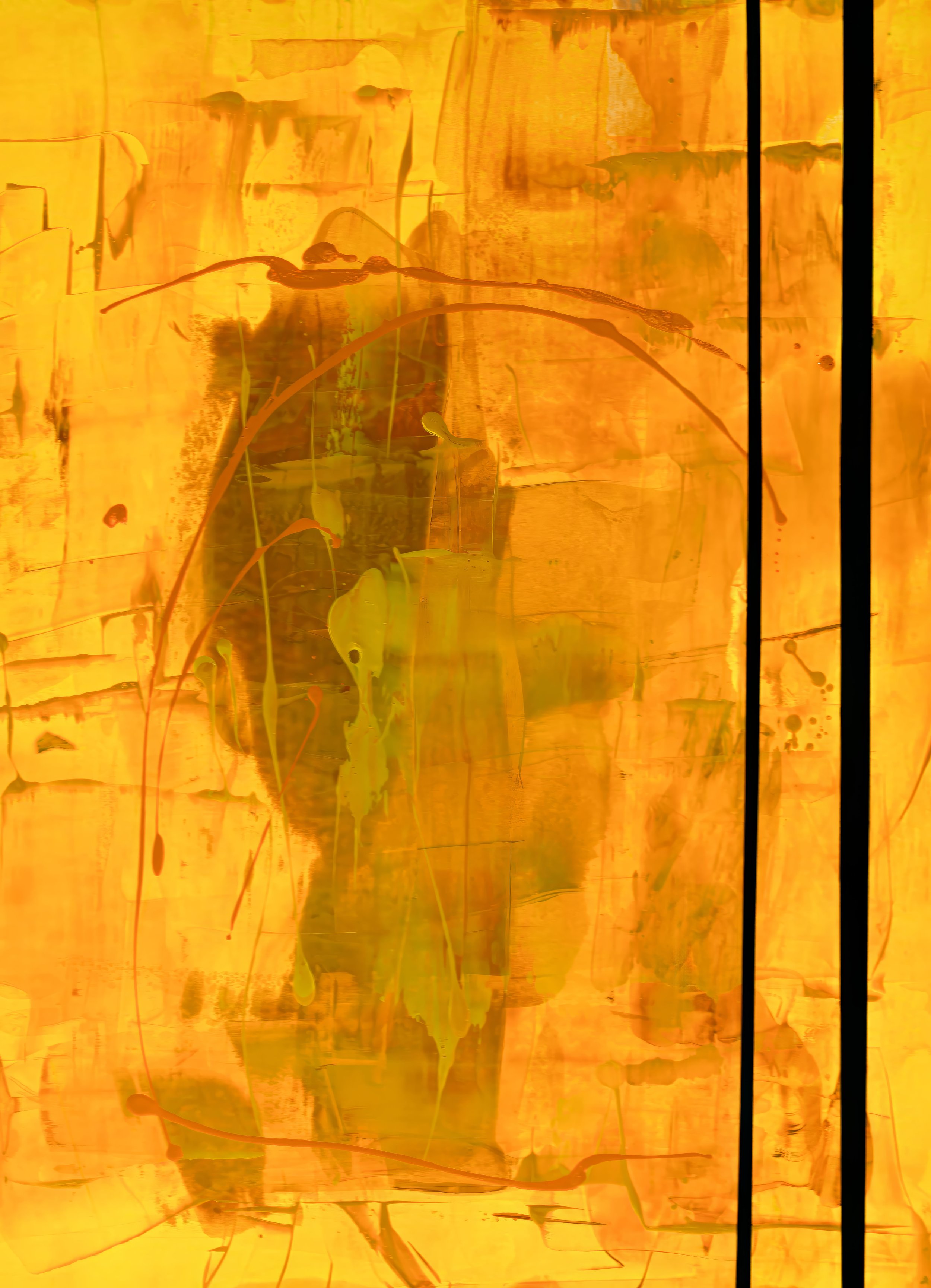
A Little Fun with Yellow — Acrylic on Paper — 22 x 30 inches

Blue Storm — Acrylic on Paper — 22 x 30 inches


